

I want to be able to follow a thought through a novel: from a loose note, to a character decision, to a chapter, and eventually to the question of whether it works on the page.
At the moment, that journey can involve a writing app, a spreadsheet, another app for notes and a row of browser tabs. Keeping all of those places in agreement becomes a job of its own. This is a large part of why I started building TexFaber. It is a passion project for my own writing as much as an attempt to make something useful for other writers.
This week, the interface began to make that ambition much easier to see. The workspace formerly called Plot became Planning. Notes developed into its own workspace, with connections back into the story. And the Analysis interface became a clearer picture of how I want a writer to examine a draft.
The screenshots below show the current development build and its example data.
The same story, at different scales
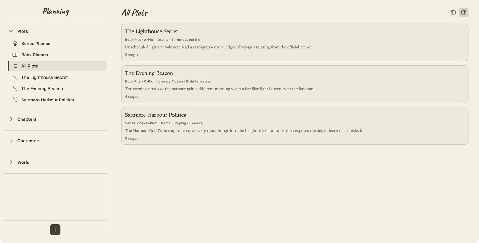
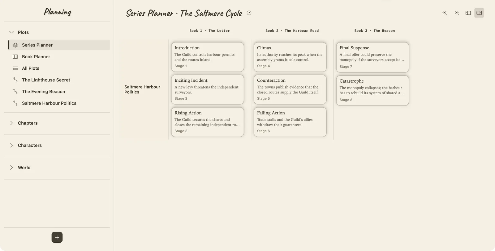
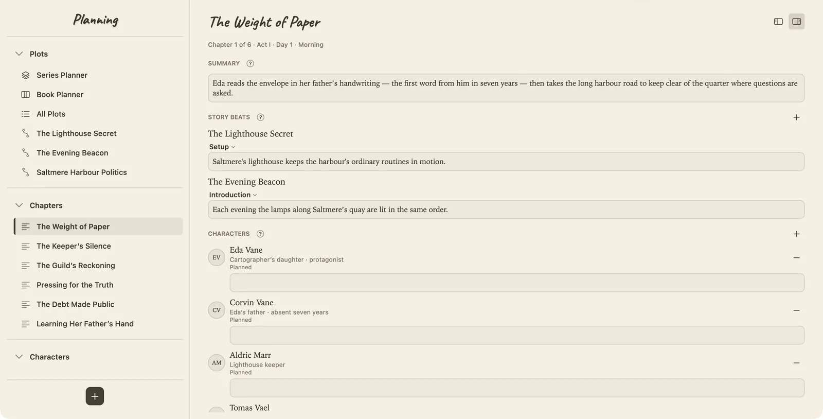
Planning now has a simple division of labour. All Plots is the place to browse the story's plot threads and open their details. Book Planner puts their beats alongside chapters. Series Planner takes the wider view, with books as its columns.
That change of scale matters. A thread can develop across several books while each book still has its own shape. I want to be able to look at either without rebuilding the outline in a different tool. Moving a beat's placement changes where it belongs; the framework's stages keep their order.
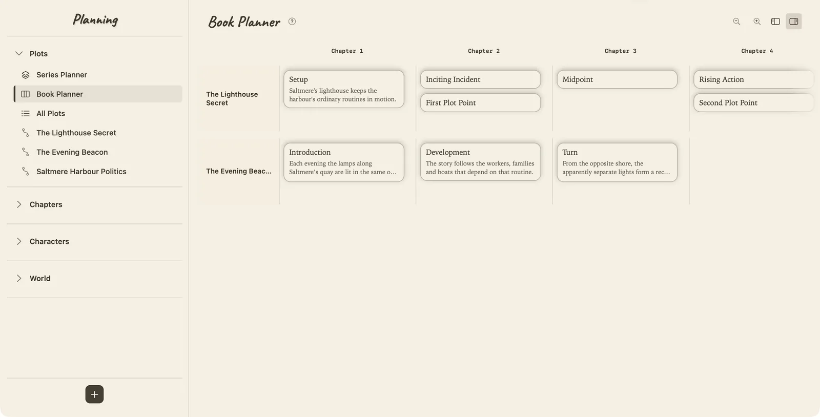
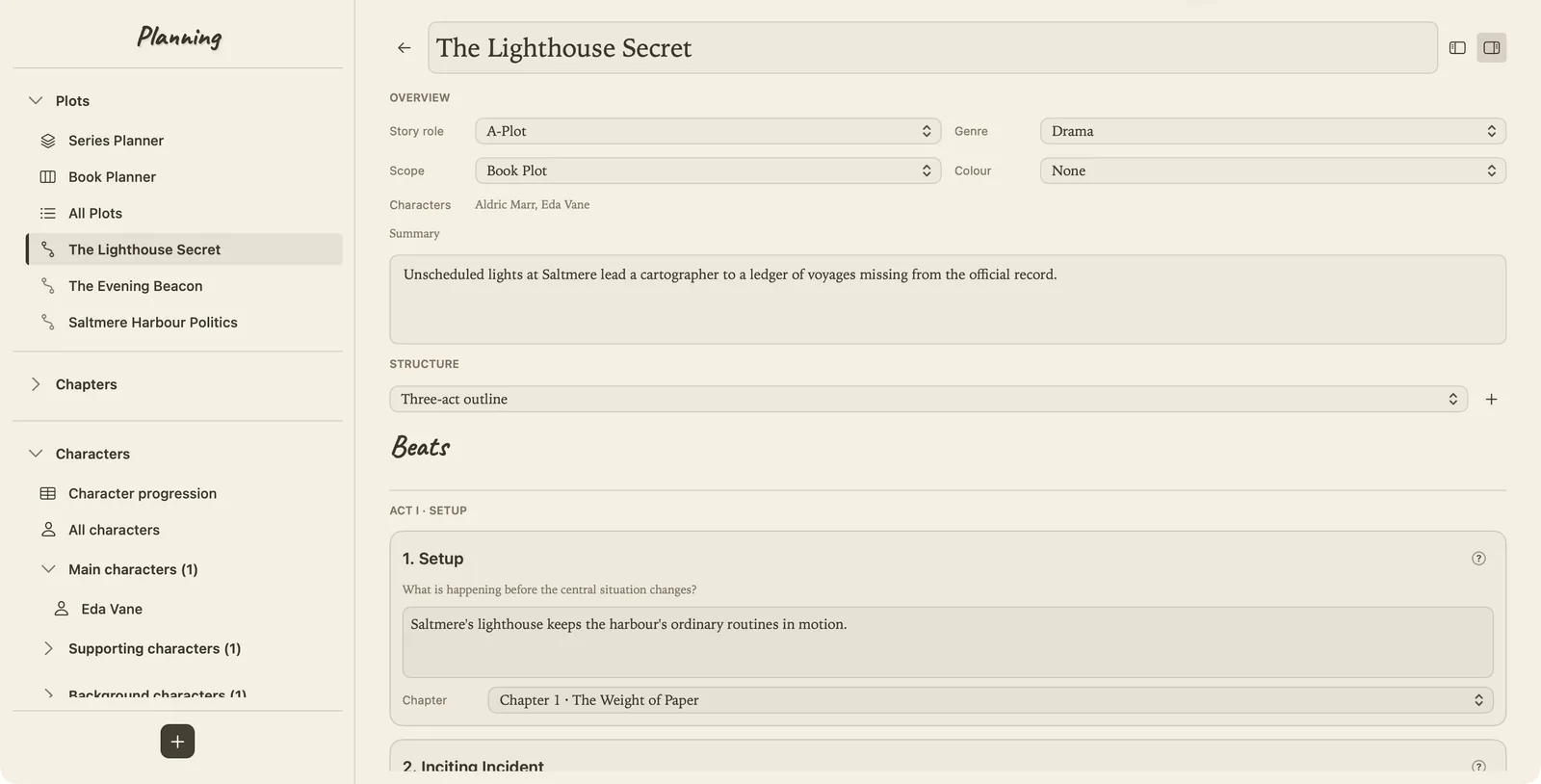
The plot details have also become proper working pages. Structure and Genre have separate jobs: a framework supplies the stages, while Genre adds optional questions to help develop them. Writers can save their own frameworks. Trying another structure keeps the writing and chapter links saved with the previous outline, so it is possible to return to it.
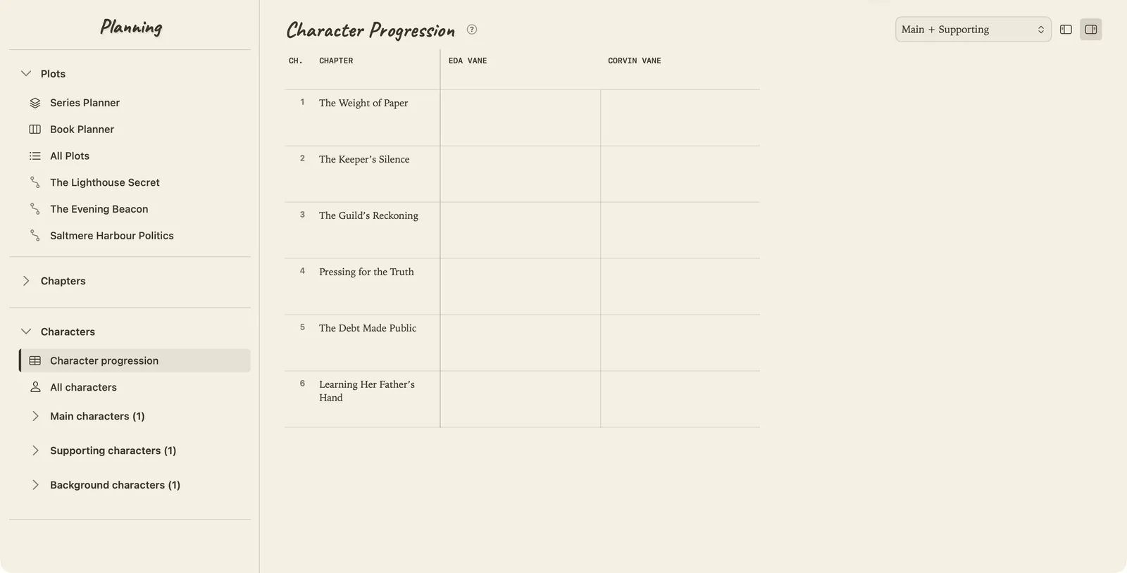
Characters needed a different treatment. Their development belongs alongside the story structure, with its own space and vocabulary. Character Progression follows them across chapters, and the character overview opens into focused pages for Motivation, Personal Development, Background & Traits, Details, Chapter Progression and Notes.
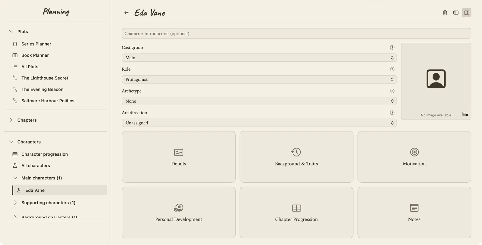
The connection I particularly like is at chapter level. A character's chapter progression note is the same writing whether I reach it through the chapter, the progression table or the character's own page. I can approach the story through the question I am thinking about and still arrive at the same information.
A note can belong in more than one place
Notes has become an important part of this. A thought about a family obligation might matter to a character, an object and a later chapter. Filing it under just one of those feels arbitrary; keeping three copies creates another problem to maintain.
A shared note can now link to several parts of the project. Those links open the relevant pages in Planning. The same note can also be reached from a character's Notes page, where quick edits stay part of the original document.
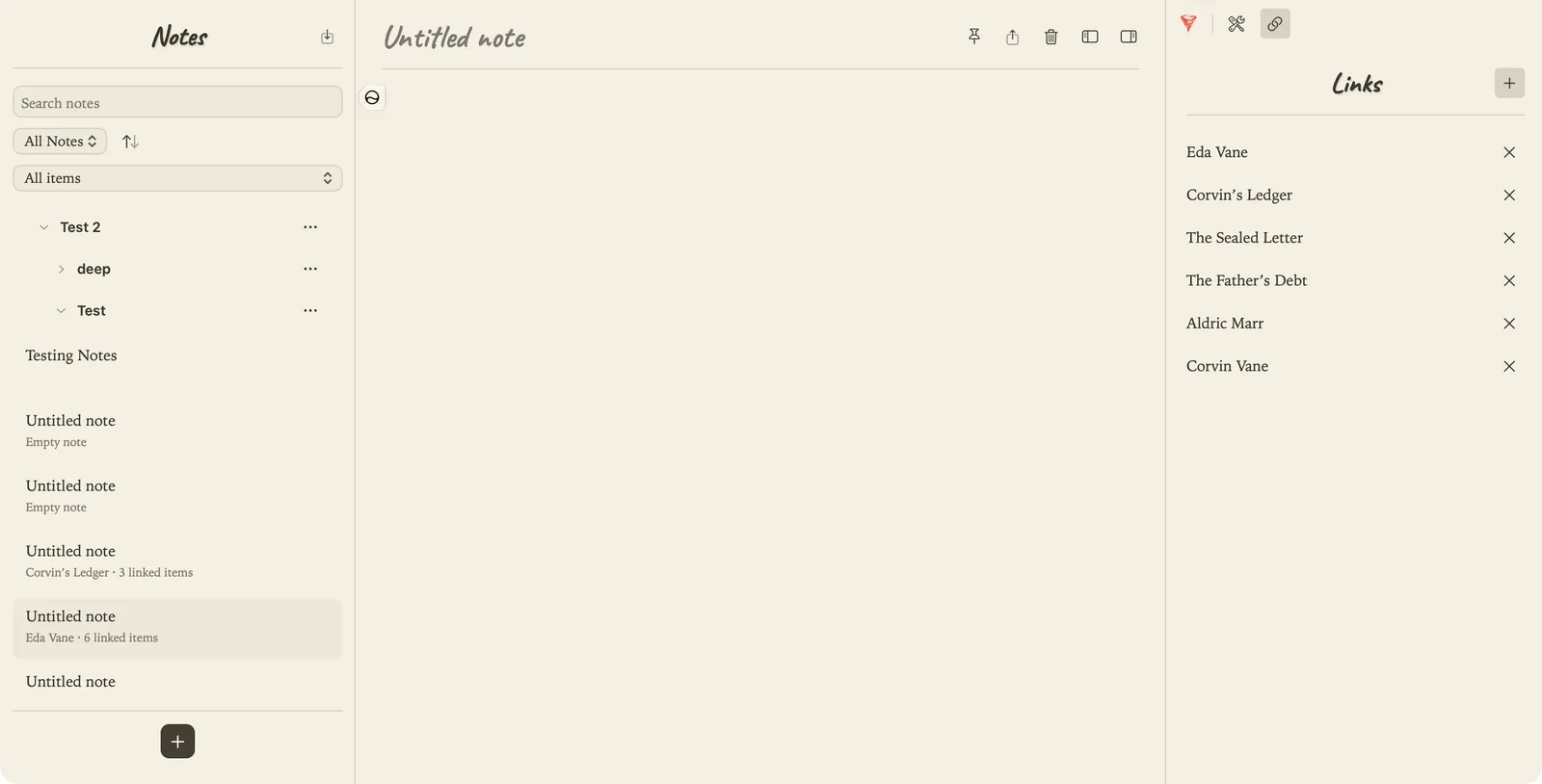
That also means being careful about what counts as established story information. Planning is a place to try things. A new character can stay private to a book's planning, and an idea in Notes does not automatically become Wiki canon. I need room to consider possibilities before deciding what belongs in the finished story.
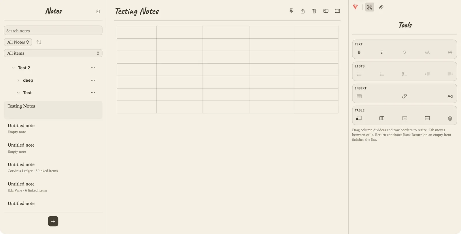
The actual note-taking tools are deliberately familiar. Tables are one of my go-to ways of making notes, so they have received particular attention, alongside bullets, numbered lists and basic formatting. The right-hand tools use the same grouped approach as Write. Notes can be organised into shallow folders and exported, with Markdown as the default and other formats available.
There has been plenty of work on the smaller interactions too: a table border that offers a resize cursor should actually resize, and a folder should open with the same movement as folders elsewhere. Those details affect how comfortable an app feels over a long writing session.
From intention to the page
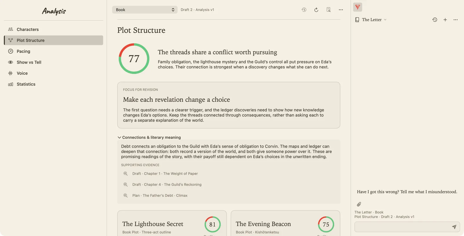
Analysis is where I want this process to lead once there is a draft to examine. Its current reports are illustrative examples used to develop the interface; connecting them to a real analysis backend is still ahead.
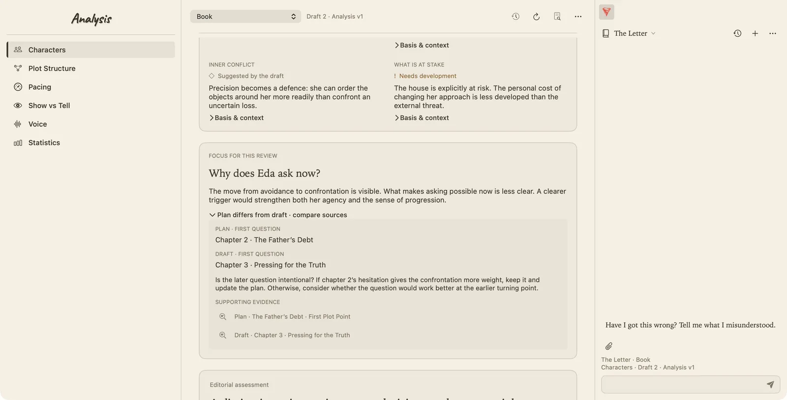
The question guiding the design is what a writer can usefully do with an observation. A concern about a character's decision needs its reasoning and the passage behind it. A difference between a plan and a draft needs enough context to decide whether the writing has gone astray or the plan has become outdated.
The preview now gives those questions more space. It includes comparisons between intention and the draft, supporting sources, and places to discuss an interpretation. The writer needs to be able to say that a hesitation is deliberate, or that a reading has missed something, without that simply becoming a request for a better score.
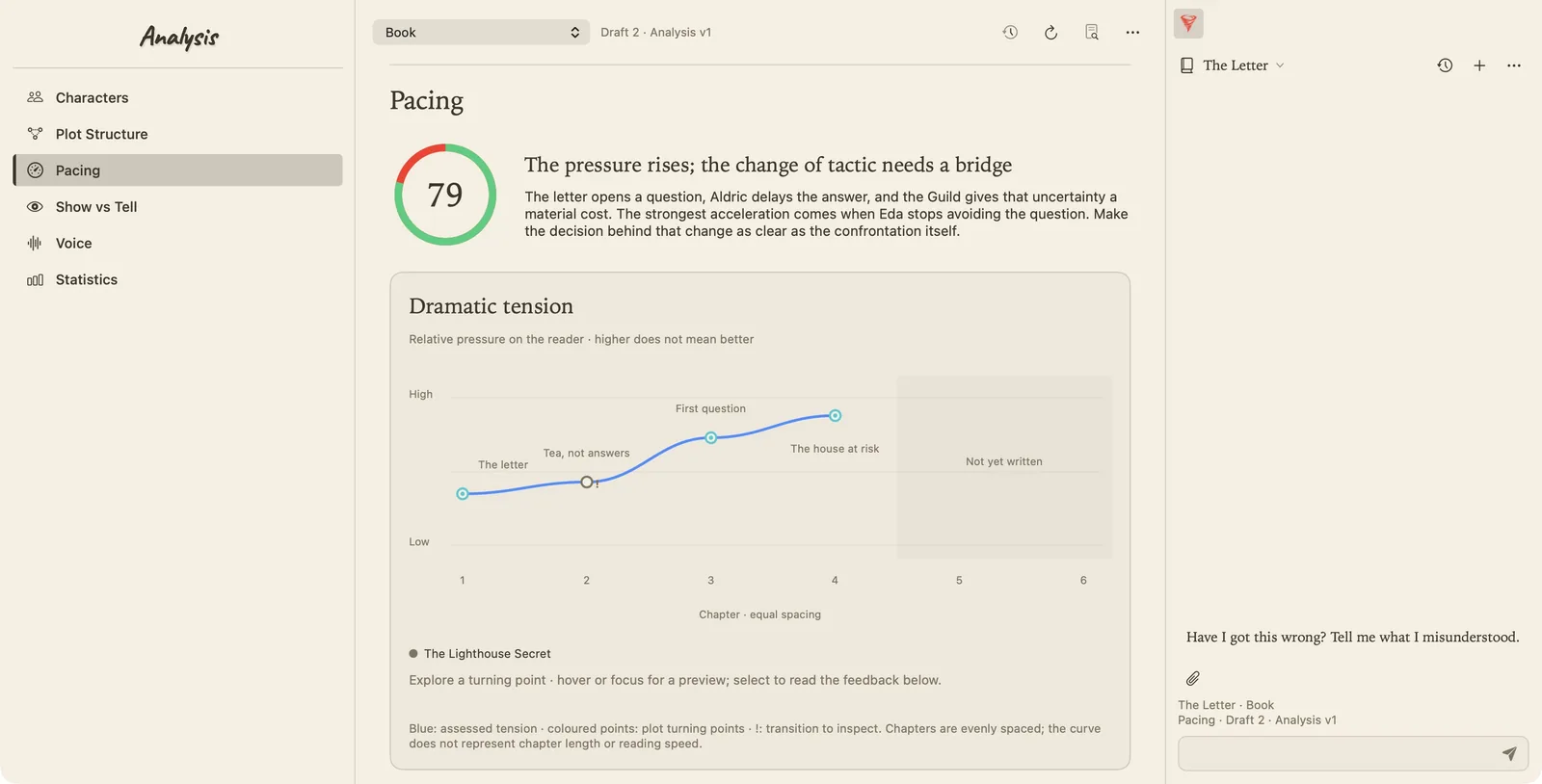
The graphs have a job beyond decoration too. A tension curve can make a transition worth inspecting easier to find. Its height is not a measure of how good the book is, and chapters that have not been written should remain unassessed. I want the interface to make those distinctions clear.
This is the part of the week's work that excites me most: I can see a route from an early idea, through the outline and the chapter, to a useful revision question. Notes and Planning already share the working material. Analysis is being shaped around how to examine what eventually reaches the page.
I am building TexFaber because I want to sit down with my own fiction and have the rest of the project close at hand. This week, that started to feel much more tangible.
More from the current build
All images show the existing development data. Notes currently includes test folders and largely empty notes; no story content was invented to fill the screens. Analysis reports, scores and curves are illustrative interface examples, with the evaluation backend still ahead.
Jamie Heerlyn
Written from development notes with AI editing assistance.


